Design new logo for Aguzzo Group. Previous branding is dated and needs a full revamp.
New branding to be contemporary & fresh. Develop a brand guidelines.
previous branding
Brand Story
Aguzzo Group provides clientele creative and dynamic in-store ambassadors Australia wide.
The services entail in-store product demonstrations with a sales focus and visual merchandising that projects positive brand awareness.
Image by Aguzzo Group
Target Audience
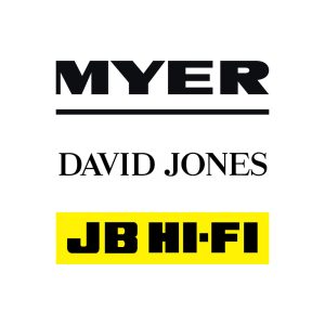
Decision makers for household appliance companies, could be either male or female but likely at a senior level. Current clients are SMEG, Myer, David Jones and other large retail stores in Australia.
Brand Personality
Corporate, accessible, competent, easy to work with, trustworthy.
Image by Aguzzo Group
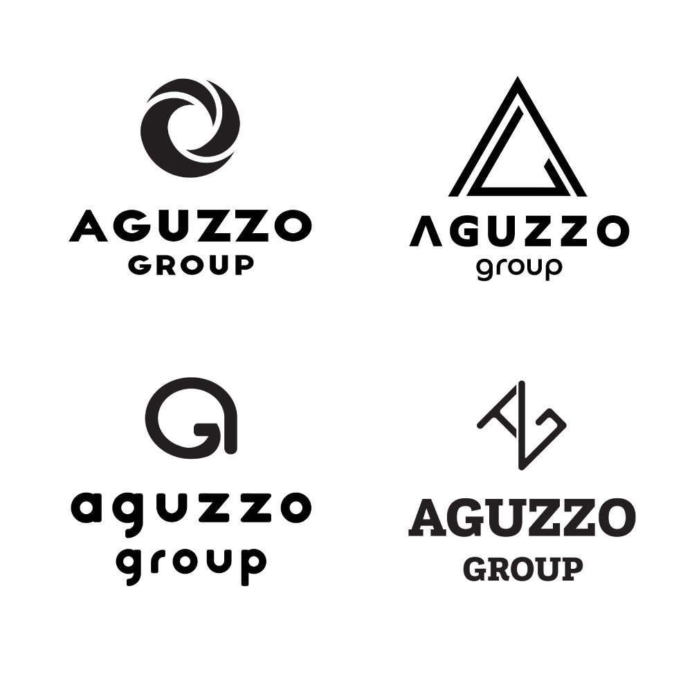
Logo Concepts
The client was offered 4 logo concepts to choose from. The concepts are a combination of a graphic device and a logotype.
We suggested to move away from using the icons of the appliances in the logo, and use a logomark and logotype combined, representing AG instead. The client was also offered the opportunity to explore different type of fonts for their logotype.
At this stage, the concepts are always presented in black and white colours.
4 initial concepts
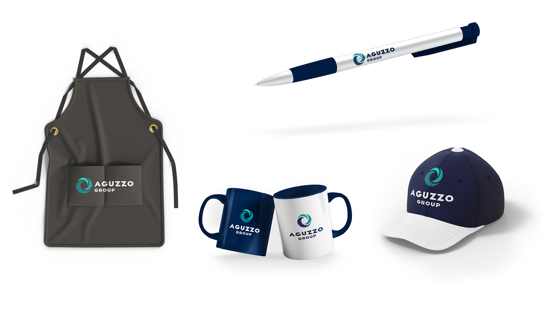
Chosen Concept
Primary Logo
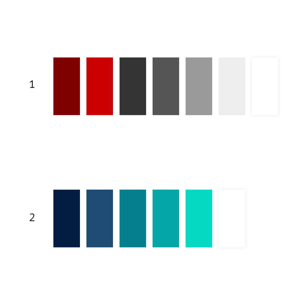
Proposed Colour Themes
1. RED
Associated with activity, strength, excitement, energy, and stimulation. Considered up-to-date.
The hue is based on the original red colour. The brightness was brought down for improved accessibility online and better results in print.
A charcoal grey was introduced to compliment bold red without creating a clash.
2. BLUE
Linked to competence, intelligence, friendliness, happiness and cheerfulness.
To move away from standard corporate blue, we shifted the background blue to purple hues (which instantly gives it a more luxurious feel) and the graphic elements colours towards green, creating a nearly neon effect which is very trendy right now.
Main Logotype: Typeface Crux, modified
Copy: Poppins
Aa Bb Cc Dd Ee Ff Gg Hg Ii Jj Kk Ll Mm Nn Oo Pp Qq Rr Ss Tt Uu Vv Ww Xx Yy Zz
0 1 2 3 4 5 6 7 8 9
Headings: Noto Serif
Aa Bb Cc Dd Ee Ff Gg Hg Ii Jj Kk Ll Mm Nn Oo Pp Qq Rr Ss Tt Uu Vv Ww Xx Yy Zz
0 1 2 3 4 5 6 7 8 9